QuickGraph AI
Overview of QuickGraph AI
What is QuickGraph AI?
QuickGraph AI stands as a cutting-edge, free online AI graph generator and chart maker designed to democratize data visualization. In an era where data drives decision-making, QuickGraph AI empowers individuals and professionals alike to effortlessly transform raw datasets into clear, professional, and insightful visual representations. This innovative platform leverages advanced artificial intelligence to simplify the complex process of creating accurate and aesthetically pleasing graphs and charts, making sophisticated data analysis accessible to everyone, regardless of their technical or design expertise.
At its core, QuickGraph AI is built for speed, simplicity, and reliability. It serves as an indispensable tool for anyone who needs to present data effectively for reports, presentations, academic papers, marketing campaigns, or everyday data needs. By automating the most challenging aspects of graph creation, it allows users to focus on the insights rather than the mechanics of visualization.
Key Features and Benefits of QuickGraph AI
QuickGraph AI is packed with features engineered to provide a seamless and powerful data visualization experience. These functionalities collectively make it a standout choice for anyone looking to elevate their data storytelling.
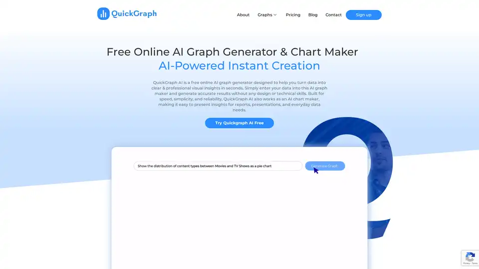
AI-Powered Instant Creation
What sets QuickGraph AI apart is its intelligent core. With its AI-powered engine, the platform can analyze your data and instantly suggest the most appropriate graph types, filtering data and identifying relevant columns without requiring explicit instructions. This eliminates the guesswork and technical specifications often associated with traditional graph creation tools, dramatically accelerating the visualization process and ensuring optimal representation of your data.
Extensive Chart Type Library
Offering an impressive array of over 30 different types of graphs and charts, QuickGraph AI caters to virtually every data visualization need. Whether you're comparing categories, tracking trends over time, or exploring complex relationships, you'll find the perfect visual format. This vast selection ensures that you can always choose the most effective way to communicate your findings, from standard bar and line graphs to advanced statistical plots and specialized financial charts.
User-Friendly Interface & No Technical Skills Required
One of the most significant advantages of QuickGraph AI is its intuitive interface. Designed with simplicity in mind, it requires absolutely no technical skills or coding knowledge. Users can simply input their data, often through copy-pasting or file upload (implied), and let the AI handle the complex visualization. This ease of use makes it an ideal solution for business professionals, students, and anyone without a background in data science or graphic design.
Professional Export & Sharing
Once your graph is perfected, QuickGraph AI facilitates professional export and sharing. While the specific file formats are not explicitly mentioned in the provided text, it's reasonable to infer support for common professional formats like PNG, JPEG, SVG, or PDF, enabling users to seamlessly integrate their visuals into reports, presentations, websites, or other digital platforms. This ensures that your insights are not only compelling but also easily distributable.
Customization to Your Brand
QuickGraph AI offers extensive customization options, allowing you to tailor your graphs to your precise specifications. From selecting colors and fonts to modifying data points and labels, you have complete control over the final output. The online graph editor enables users to customize visuals to match brand kit details, ensuring consistency and professionalism across all your communications. This flexibility empowers users to express their creativity while maintaining data integrity.
Secure and Reliable Data Handling
Understanding the critical importance of data privacy and security, QuickGraph AI prioritizes the safety and confidentiality of your information. The platform employs strong security measures to ensure that your uploaded data is protected at all times, fostering trust and reliability for all users.
How Does QuickGraph AI Work?
QuickGraph AI operates on a straightforward principle: simplify data visualization through intelligent automation. The process is designed to be intuitive and fast:
- Data Input: Users begin by entering their raw data into the platform. This can be as simple as pasting spreadsheet data directly into the interface.
- AI Analysis & Suggestion: The core AI algorithms then spring into action. Instead of requiring users to manually specify columns or chart types, the AI automatically identifies relevant data columns and, based on the user's query or data structure, recommends a variety of suitable graph and chart types.
- Instant Generation: With a few clicks, the AI-powered engine generates the desired graph in mere seconds, transforming the raw data into a visual story.
- Customization & Refinement: Users can then leverage the custom graph maker to fine-tune every aspect of the visualization—from colors, fonts, and labels to specific data point modifications—ensuring the output perfectly aligns with their aesthetic and analytical needs.
- Export & Share: Finally, the polished visual can be exported and shared professionally, ready for inclusion in reports, presentations, or online content.
Who Can Benefit from QuickGraph AI?
QuickGraph AI is a versatile tool with broad applicability across numerous industries and professional roles. Its ability to create clear, impactful data visualizations without requiring technical expertise makes it invaluable for:
- Marketing Strategists: To visualize campaign performance, customer demographics, and market trends.
- Financial Analysts: For creating candlestick charts, OHLC charts, and waterfall charts to track price movements, financial performance, and incremental changes.
- Business Consultants: To present complex business data, process flows, and strategic insights to clients and stakeholders.
- Educators and Students: For making academic reports more engaging and comprehending complex data concepts visually.
- Healthcare Professionals: To visualize patient data, research findings, and health trends.
- UX Designers: To visualize user feedback, interaction patterns, and research data, ensuring data always looks stunning.
- Data Analysts: Even experienced analysts can use it for quick prototyping or for creating attractive client-facing visuals.
- Entrepreneurs and Small Business Owners: For quickly understanding sales data, operational efficiency, and market share without investing in specialized software or personnel.
Essentially, anyone who needs to make data more understandable, engaging, and actionable will find QuickGraph AI an indispensable ally.
Why Choose QuickGraph AI for Your Data Visualization Needs?
Choosing the right data visualization tool can significantly impact the clarity and persuasiveness of your data storytelling. QuickGraph AI offers several compelling advantages:
- Unmatched Simplicity: It removes the barriers of complexity, allowing anyone to create sophisticated visuals.
- AI-Powered Intelligence: The AI not only generates graphs but also intelligently suggests the best visualization styles, acting as a creative assistant.
- Speed and Efficiency: Generate professional graphs in seconds, drastically cutting down on the time typically spent on manual chart creation and tweaking.
- Comprehensive Chart Variety: With over 30 chart types, you're equipped for any data scenario, from simple comparisons to complex multivariate analyses.
- Complete Customization: Full control over design elements ensures your graphs align with your brand and message.
- Cost-Effectiveness: As a free online tool, it provides high-value capabilities without any financial investment, making advanced data visualization accessible to all.
- Security Focus: A commitment to data safety ensures your sensitive information remains protected.
Diverse Chart Types Supported by QuickGraph AI
QuickGraph AI boasts a comprehensive library of chart types, enabling users to tackle a wide range of data visualization challenges:
- Bubble Charts: Visualize data with color-coded and size bubbles to identify outliers and trends, ideal for showing relationships between three variables.
- Area Charts: Track changes over time with layered areas, effortlessly highlighting the contribution of different components and showing cumulative totals.
- Scatter Plots: Explore relationships between two variables to reveal patterns, correlations, or clusters in your data, often used in scientific research.
- Pie Charts: Effortlessly show the proportion of categories within a whole, helping to understand the distribution of data at a glance.
- Line Graphs: Plot data points connected by lines to visualize trends and changes over time, perfect for time-series data analysis.
- Bar Graphs: Intuitively compare categorical data using bars of different lengths, highlighting differences and similarities across groups.
- Histograms: Group data into intervals to show distribution patterns like frequency and spread, revealing trends and anomalies instantly.
- Dual Charts: Combine two different chart types into a single visualization, such as a bar and line graph, to compare data effortlessly and show multiple metrics simultaneously.
- Box Plot: Showcase data distribution through outliers, median, and quartiles to identify variability and central tendency.
- Heatmap: Represent data as a colored grid to visualize patterns and correlations in large datasets, excellent for showing density or intensity.
- Map: Geographically represent your data on a map to visualize attractive spatial patterns and trends, invaluable for regional analysis.
- Gauge Charts: Display a metric's value on a circular scale to track progress toward an objective, commonly used in dashboards for KPIs.
- Funnel Charts: Visualize a process with stages to understand and comprehend potential bottlenecks, typically used for sales pipelines or user flows.
- Radar Charts: Compare multiple variables for a single data point, identifying strengths and weaknesses across different attributes.
- Polar Area Charts: Showcase cyclical data on a polar coordinate system to visualize periodic data, often used for seasonal trends.
- Percentage Bar Graph: Visually compare parts of a whole across different categories, ideal for survey responses or compositional analysis.
- Bi-directional Bar Chart: Display positive and negative values on opposite sides of a central axis, great for comparing two related metrics or before/after scenarios.
- Diverging Bar Chart: Visualize responses or metrics split around a neutral midpoint, effective for showing agreement/disagreement scales.
- Violin Plot Chart: Combine box plots with density estimates to show data distribution more vividly, offering deeper statistical insights.
- Waterfall Chart: Break down incremental changes in values, often used in financial reporting to understand cumulative impacts of various factors.
- Gantt Chart: Track tasks and timelines in project management, visually managing workflows and deadlines.
- Sunburst Chart: Visualize hierarchical data with layered segments radiating from the center, providing a compact view of nested categories.
- Treemap Chart: Display nested data as proportional rectangles for a compact view of hierarchies, excellent for showing part-to-whole relationships with multiple levels.
- Candlestick Chart: Show price movements (open, high, low, close), ideal for financial analysis and stock trading visuals.
- OHLC Chart: An Open-High-Low-Close chart, used in trading to show stock price changes over time, similar to candlestick charts but without the body fill.
- Sankey Chart: Illustrate flow and proportions, perfect for resource allocation, energy flow, or process visualization with interactive elements.
- Table Maker: Transform raw data into structured, sortable tables for easy analysis, a fundamental tool for data presentation.
- Indicator Chart: Show KPIs or performance metrics using dials, gauges, or numbers, creating smart indicators for dashboards and reports.
- Mekko Chart (Marimekko): Display data in varying widths and heights to show market share across dimensions, often used for market segmentation.
- Pictogram Chart: Replace bars with icons or images for a fun, infographic-style visualization, engaging for a general audience.
- Triangle Bar Chart: Offer a creative twist on regular bars, adding visual interest to your data with stylish and unique triangular visualizations.
What Our Clients Say About QuickGraph AI
The impact of QuickGraph AI is best reflected in the experiences of its users, who span various professional fields:
- Emma R., Data Analyst: "QuickGraph AI Editor transformed how we present data. The AI-powered insights and seamless interactive editor make complex visualizations effortless and dynamic. It was like having a data scientist and a designer in one tool!"
- Jake M., Marketing Strategist: "I used to spend hours tweaking charts, but QuickGraph AI Editor does it in minutes. The AI understands trends better than I do—it's like magic for data storytelling!"
- Sophia L., Business Consultant: "Creating an Interactive Line Chart or a Dynamic Doughnut Graph has never been this easy. QuickGraph AI Editor makes data visualization feel like art!"
- Daniel K., Financial Analyst: "I no longer dread making reports! QuickGraph AI Editor auto-generates engaging Time Series Charts and Trend Graphs that make my presentations pop. My boss was seriously impressed!"
- Priya S., UX Designer: "The AI suggests the best visualization styles, from a Radial Treemap to a Violin Density Plot. It's like having a creative assistant that ensures my data always looks stunning!"
These testimonials underscore the tool's effectiveness in enhancing productivity, improving data comprehension, and delivering professional results across diverse use cases.
Frequently Asked Questions (FAQ) about QuickGraph AI
Here are answers to some common questions about QuickGraph AI:
What is QuickGraph AI?
QuickGraph AI is an innovative, AI-powered online graph maker designed to simplify data visualization for both technical and non-technical professionals. It aims to empower users to effortlessly transform raw data into insightful, high-quality graphs and charts, streamlining analysis and decision-making.
Can I customize the appearance of my graphs?
Yes, absolutely. QuickGraph AI offers a custom graph maker that gives you complete liberty to custom-make your graphs to your precise specifications, including graph types, colors, fonts, and more.
Do I need any technical skills to use QuickGraph AI?
No, QuickGraph AI is designed to be user-friendly and requires no technical or design skills. Its intuitive interface allows you to input your data, choose your graph type, and let the AI do the rest.
Can I share my graphs with others?
Yes, the platform allows you to export and share your professionally created graphs, making it easy to distribute your insights for reports, presentations, and collaborations.
Will my information be safe with you?
QuickGraph AI prioritizes the safety and privacy of your data. Strong security measures are in place to ensure your data is safe and protected at all times.
What file formats does your platform support?
While specific formats are not listed, QuickGraph AI supports professional export, implying compatibility with common formats like PNG, JPEG, SVG, and PDF for versatile use across different platforms and documents.
What is QuickGraph AI’s data privacy policy?
QuickGraph AI is committed to protecting user data and employs robust security measures. For detailed information, users are encouraged to refer to the comprehensive Privacy Policy linked on the website (implied from footer).
Conclusion: Visualize Your Data Creatively with QuickGraph AI
QuickGraph AI is more than just an online graph generator; it's a comprehensive data visualization solution that combines the power of artificial intelligence with unparalleled ease of use. By providing a rich selection of chart types, extensive customization options, and a commitment to data security, it empowers users from all backgrounds to uncover hidden insights and tell compelling data stories. Join the QuickGraph AI community today and transform how you see and present your data, bringing your raw numbers to vibrant life with professional, engaging visuals.
Tags Related to QuickGraph AI