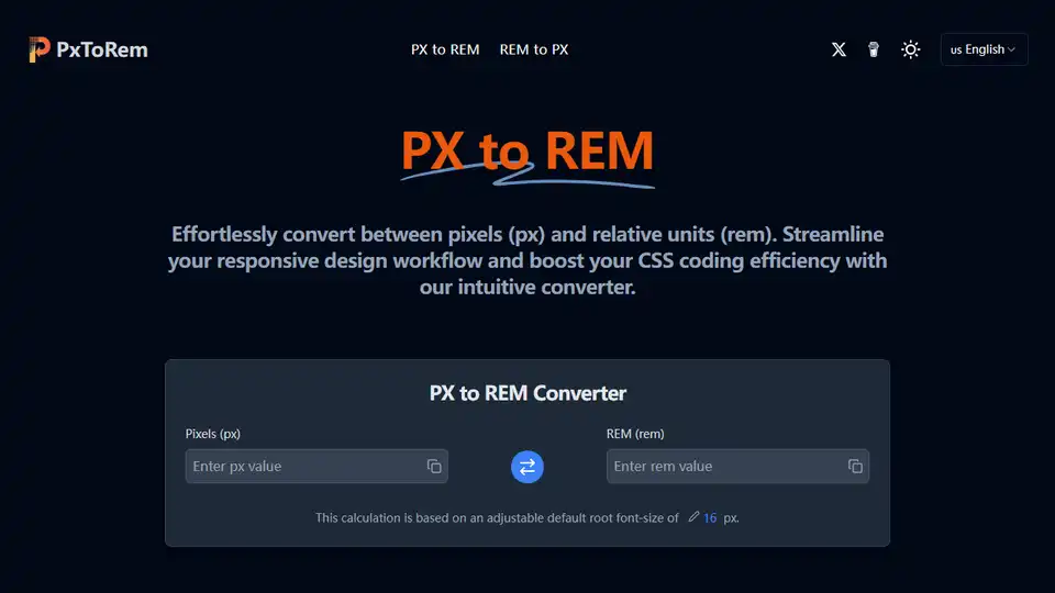
PX to REM Converter
Overview of PX to REM Converter
PX to REM Converter: A Free Online CSS Unit Conversion Tool
What is PX to REM Converter?
The PX to REM Converter is a free online tool designed to simplify the process of converting pixel (px) values to relative units (rem) and vice versa. This tool is essential for web developers aiming to create responsive and scalable web designs.
How does PX to REM Converter work?
The converter operates based on the root font size, typically 16px in most browsers. It divides the pixel value by the root font size to determine the equivalent rem value. For instance, if the root font size is 16px, then 16px equals 1rem. The tool also allows users to customize the root font size to meet specific design requirements.
Why is PX to REM Converter important?
Using rem units instead of pixels offers several advantages, particularly in responsive web design. Rem units scale with the root font size, making it easier to maintain consistent proportions across different screen sizes and user preferences. This flexibility is crucial for creating designs that adapt seamlessly to various devices.
Where can I use PX to REM Converter?
The PX to REM Converter can be used in various web development scenarios, including:
- Responsive Design: Ensuring consistent sizing across different screen sizes.
- UI Design: Creating scalable user interfaces that adapt to user preferences.
- CSS Coding: Streamlining the workflow by quickly converting pixel values to rem equivalents.
Key Features
- Responsive Design Friendly: Rem units scale with the root font size, making designs adaptable.
- Customizable Base Size: Adjust the root font size for accurate conversions.
- High Accuracy: Precise conversions with up to four decimal places.
- Free to Use: No hidden costs or limitations.
- Easy Copy & Paste: Quickly copy converted values.
- Handles Decimal Values: Supports decimal values for precise calculations.
How to Use PX to REM Converter
- Set Base Font Size: Adjust the base font size if your project doesn't use the default 16px.
- Input Your PX Value: Enter the pixel (px) value to convert. The REM equivalent will appear instantly.
- Copy and Use: Click the copy button to grab the converted REM value and paste it into your CSS.
FAQs
- What is PX in web design and how does it relate to REM? PX (pixel) is a fixed unit, while REM is a relative unit that scales with the root font size.
- What is REM in CSS and how does it relate to PX? REM (Root EM) is based on the root element's font size. 1rem is equal to the root font size (usually 16px).
- How does our PX to REM converter work? It divides the pixel value by the root font size.
- Why use REM instead of PX in responsive web design? REM scales with the root font size, making it easier to maintain proportions across different screen sizes.
- What's the default root font size for PX to REM conversion? The default is 16px.
- Can I use the PX to REM converter for responsive design? Yes, it helps maintain consistent proportions across different screen sizes.
- Is this PX to REM converter free to use? Yes, it is completely free.
- How accurate are the PX to REM conversions? It provides highly accurate results, typically showing up to four decimal places.
- Can I copy the converted PX or REM values directly? Yes, you can easily copy the converted values.
- How can I use REM units effectively in my CSS? Set a base font size on the root element and use REM for font sizes, margins, and paddings.
- Can the PX to REM converter handle decimal values? Yes, it can handle decimal values for both PX and REM inputs.
In conclusion, the PX to REM Converter is a valuable tool for web developers looking to streamline their CSS coding process and create responsive web designs. Its ease of use, accuracy, and customizability make it an essential resource for modern web development.
Best Alternative Tools to "PX to REM Converter"
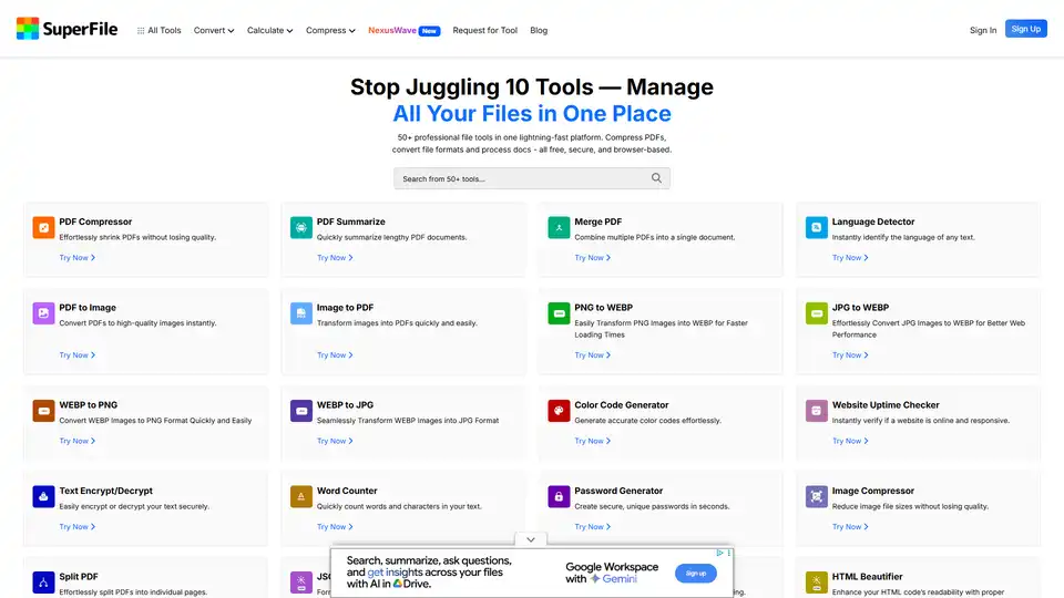
Explore SuperFile's free online PDF and image tools, including converters, editors, and compressors. Simplify digital tasks with this all-in-one platform.

Code Genius: AI code generator for React, Vue JS, Tailwind CSS. Streamline workflow, accelerate development with AI solution.

Trae Plugin is an AI code assistant that provides code completion, explanation, unit test generation, and debugging within VSCode and JetBrains, supporting 100+ languages.

Devra is an AI coding worker bee that runs on your desktop. It enhances code, creates modules, and writes unit tests using dynamic context and voice dictation. Available on Mac, Windows, and Linux.
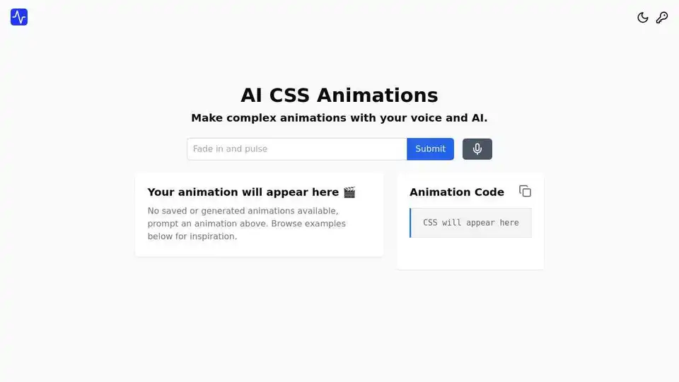
AI CSS Animations is an innovative tool that enables users to create complex CSS animations using simple voice or text prompts. Generate, preview, and customize animations in seconds for enhanced web experiences.
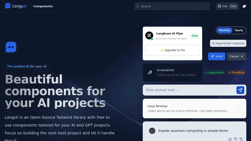
LangUI is an open-source Tailwind CSS library providing free UI components tailored for AI and GPT projects. Build your next AI project with beautifully crafted, customizable components.

Windframe is a drag-and-drop visual builder for Tailwind CSS, enabling developers and designers to quickly create websites with ease and efficiency.
WindChat is a browser extension that allows you to preview Tailwind CSS HTML in ChatGPT, turning it into a front-end development assistant for rapid prototyping and instant feedback.
Webstudio is an open-source website builder that allows users to create maintainable and fast websites with visual CSS and no-code development. It offers features like reusable styles, dynamic content integration, and cloud hosting.
MightyMeld accelerates React development with visual tools for Tailwind CSS. Design UI visually, generate clean code, and use AI for styling. Ideal for web developers using component-based libraries.
IMG2HTML uses AI to convert images to HTML CSS code instantly. Clone websites, export React components, and generate code with pixel-perfect accuracy. Transform images to code automatically!

CodeSnaps offers a React and Tailwind CSS UI library with production-ready components and an AI site generator. Build stunning websites quickly without installations—copy, paste, and customize in minutes for developers and teams.
Fronty is an AI-powered image to HTML CSS converter that transforms screenshots or designs into clean, editable code. Build websites quickly without coding skills, featuring a no-code editor and hosting for seamless launches.

Horizon UI is a free React admin template provider for Chakra UI, NextJS, and Tailwind CSS. It offers a variety of trendy React templates and integrates with popular programming languages/frameworks for dashboard building.